
In today’s competitive spray foam insulation market, leveraging data visualization is crucial for making informed marketing decisions. Data visualization transforms raw data into visually accessible formats like charts, graphs, and maps, which can significantly enhance your marketing reports. This comprehensive guide will explore how to use data visualization effectively in your spray foam insulation marketing reports to drive business growth and optimize strategies.
The Value of Data Visualization in Marketing
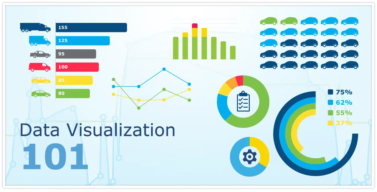
Understanding Data Visualization
Data visualization is the graphical representation of information and data. By using visual elements like charts, graphs, and maps, it makes complex data more understandable and accessible. Effective data visualization helps stakeholders quickly grasp the meaning behind the numbers, leading to better decision-making.
Why Data Visualization is Essential for Spray Foam Insulation Marketing
For spray foam insulation contractors, data visualization provides several key benefits:
- Enhanced Clarity: Visualizations simplify complex data sets, making them easier to interpret and act upon. For example, a line chart showing monthly sales trends can quickly highlight whether your sales are growing or declining.
- Trend Identification: By visualizing data over time, you can identify trends and patterns that might not be immediately apparent from raw data alone. For instance, a heat map can reveal high-performing geographic regions, allowing you to tailor your marketing efforts more effectively.
- Performance Tracking: Data visualizations make it easier to track the success of marketing campaigns and strategies. Dashboards that combine various metrics can provide a comprehensive view of how different marketing channels are performing.
Steps to Implement Data Visualization in Your Marketing Reports
Define Your Objectives
Start by clearly defining the objectives of your marketing reports. Are you evaluating the success of a recent campaign, understanding customer behavior, or assessing ROI? Clear objectives will guide the selection of visualizations and ensure your reports are focused and relevant.
Example: If your goal is to assess the success of a new marketing campaign, your report might focus on visualizations that track campaign performance, lead generation, and conversion rates.
Collect and Prepare Data
Accurate and relevant data is essential for effective visualization. For spray foam insulation marketing reports, gather data from various sources, including:
- Lead Generation Metrics: Track sources of leads, conversion rates, and cost per lead.
- Sales Data: Include monthly sales figures, average deal size, and revenue growth.
- Customer Demographics: Collect information on customer age, location, and other demographic details.
- Website Analytics: Analyze traffic sources, bounce rates, and time spent on site.
Ensure that your data is clean, accurate, and up-to-date to avoid misleading results.
Example: Before creating visualizations, clean your data to remove any inconsistencies or errors. Ensure that data from different sources is correctly integrated.
Select Visualization Tools
Choose the right tools for creating your visualizations. Popular options include:
- Google Data Studio: A free tool for creating interactive dashboards and reports. It allows you to connect various data sources and create customized visualizations.
- Tableau: Offers advanced data visualization features and extensive customization options. It is ideal for creating interactive and detailed reports.
- Microsoft Power BI: Useful for creating detailed reports and interactive dashboards with advanced analytical capabilities.
- Excel: Ideal for basic charts and graphs and is widely accessible.
Select a tool that aligns with your technical expertise and reporting needs.
Example: If you need interactive dashboards, Google Data Studio or Tableau may be better suited for your needs compared to Excel.
Design Effective Visualizations
Focus on clarity and simplicity when designing your visualizations:
- Clear Labels: Ensure that all charts and graphs are clearly labeled to facilitate easy interpretation.
- Appropriate Visualization Types: Match the type of visualization to the data being presented. For instance, use a pie chart for distribution and a line chart for trends.
- Avoid Overloading: Keep visuals simple and avoid cluttering them with excessive information. Aim for a clean and focused presentation.
Example: Use a line chart to show sales trends over time and a bar chart to compare lead sources. Ensure that each chart is labeled clearly and avoids unnecessary details.
Integrate Visualizations into Reports
Incorporate your visualizations into comprehensive marketing reports. Structure your reports to provide context and interpretation for each visualization:
- Executive Summary: Provide a high-level overview of key findings and insights.
- Detailed Analysis: Offer in-depth interpretation of each visualization, highlighting significant trends and metrics.
- Recommendations: Include actionable insights based on the data, such as adjustments to marketing strategies or budget allocations.
Example: Your report might start with an executive summary highlighting key trends, followed by detailed charts and graphs with in-depth analysis, and conclude with recommendations based on the findings.
Share and Review
Distribute your reports to relevant stakeholders, including your team and clients. Regularly review and update your visualizations based on feedback and changing business needs. This continuous improvement process ensures that your reports remain effective and valuable.
Example: Share your reports with your marketing team and gather feedback on the clarity and usefulness of the visualizations. Make necessary adjustments based on this feedback.
Real-World Examples of Data Visualization
Campaign Performance Tracking
Use a combination of bar charts and line graphs to monitor the performance of a new marketing campaign:
- Line Chart: Display how website traffic increased over the campaign period.
- Bar Chart: Compare the number of leads generated from different channels (e.g., social media, email marketing, PPC).
This combination helps you quickly identify which channels are most effective and adjust your strategy accordingly.
Example: A line chart showing a spike in website traffic during a campaign period, paired with a bar chart comparing leads from social media and PPC ads. This allows you to determine which channel had the greatest impact on traffic and leads.
Customer Segmentation Analysis
Use pie charts and heat maps to gain insights into your customer base:
- Pie Chart: Show the percentage breakdown of customers by location to identify active regions.
- Heat Map: Highlight high-density areas for leads or sales to focus your marketing efforts.
These visualizations help you understand customer distribution and tailor your marketing strategies to high-performing areas.
Example: A pie chart showing customer distribution by state and a heat map highlighting regions with the highest lead density. This helps you target marketing efforts more effectively based on geographic performance.
ROI Evaluation
Evaluate the return on investment (ROI) for your marketing activities using scatter plots:
- Scatter Plot: Plot marketing spend against lead generation to identify correlations. This helps you understand how different levels of investment impact results.
Example: A scatter plot showing marketing spend versus the number of leads generated. This visualization can reveal how increasing or decreasing spend affects lead generation and help optimize your budget allocation.
Best Practices for Data Visualization
Stay Updated with Trends
Data visualization techniques and tools are constantly evolving. Stay informed about the latest trends and best practices by following industry blogs, attending webinars, and participating in relevant forums. This helps ensure you are using the most effective techniques and tools.
Example: Subscribe to industry newsletters or join professional networks focused on data visualization to keep up with new developments.
Ensure Data Accuracy
Accurate data is essential for reliable visualizations. Regularly audit your data sources and processes to maintain high data quality. Implement robust data management practices to avoid errors and ensure your visualizations reflect true performance.
Example: Periodically review your data collection and processing methods to ensure accuracy and consistency. Implement data validation checks to catch errors early.
Optimize for Mobile
Ensure your visualizations are mobile-friendly. Design responsive layouts and ensure fast loading times to enhance the user experience for those accessing reports on mobile devices.
Example: Use responsive design principles to ensure that charts and graphs are easily viewable on smaller screens. Test your visualizations on various devices to ensure compatibility.
Utilize Interactive Features
Interactive dashboards and reports can provide a more engaging experience compared to static visuals. Tools like Google Data Studio and Tableau offer interactive features that allow users to explore data in more detail, improving engagement and understanding.
Example: Incorporate interactive elements such as filters and drill-downs in your dashboards to allow users to explore different aspects of the data based on their interests.
Get Expert Help with Your Marketing Reports
At Spray Foam Genius Marketing, we specialize in helping spray foam insulation contractors leverage data visualization to enhance their marketing reports. Our team of experts can assist you in creating impactful visualizations that provide valuable insights into your marketing performance.
For personalized support and to learn more about our services, Call us at 877-840-FOAM for USA and 844-741-FOAM for Canada visit our website at sprayfoamgeniusmarketing.com, or email us at [email protected] to get started.
Let us help you unlock the full potential of your data and drive your business forward!

- 5 Google My Business Hacks to Double Your Leads for Spray Foam Insulation Contractors - January 14, 2025
- Why Spray Foam Contractors Cannot Ignore Reputation Management in 2025 - January 13, 2025
- Local SEO Secrets Every Spray Foam Contractor Must Know to Win in 2025 - January 13, 2025