
In today’s fast-paced digital world, mobile responsiveness is no longer a luxury—it’s a necessity. As the landscape of internet usage shifts, more potential customers are browsing and making decisions from their mobile devices. For spray foam insulation contractors, ensuring that your website is mobile-responsive is crucial not only for providing a seamless user experience but also for optimizing your site’s performance in search engines. At Spray Foam Genius Marketing, we specialize in creating and optimizing websites tailored specifically for spray foam insulation contractors, ensuring that your site performs effectively across all devices. In this guide, we’ll explore why mobile responsiveness is critical and how it can benefit your business.
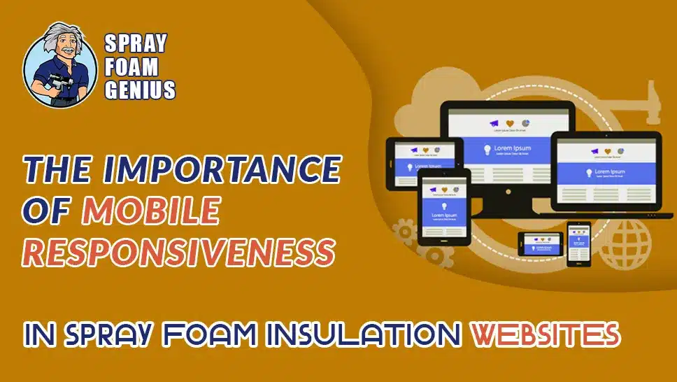
What is Mobile Responsiveness?
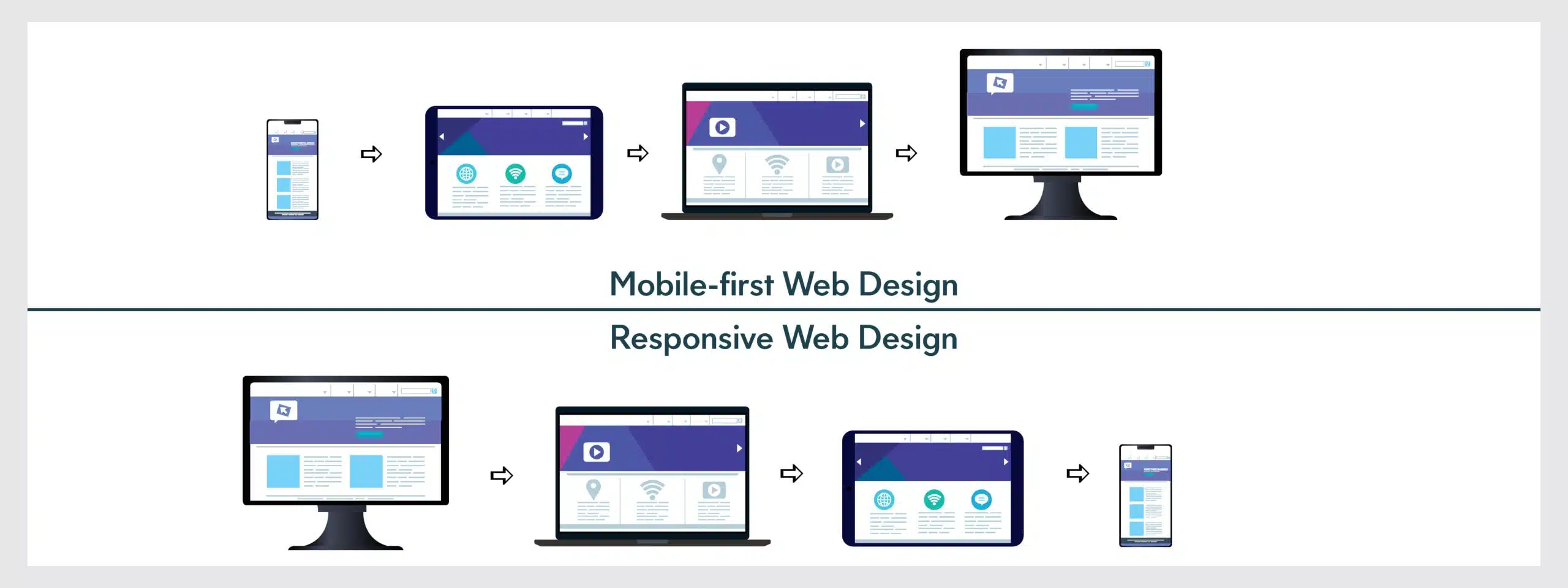
Mobile responsiveness refers to a website’s ability to adapt its layout, content, and functionality based on the device being used to view it, whether that’s a smartphone, tablet, or desktop computer. A mobile-responsive website adjusts dynamically to different screen sizes and orientations, providing a user-friendly experience no matter how the site is accessed.
Why Mobile Responsiveness Matters for Spray Foam Insulation Websites
1. Enhanced User Experience
Providing an excellent user experience is crucial for retaining visitors and converting them into customers. With a growing number of users accessing websites via their smartphones, having a mobile-responsive site is essential for delivering a smooth and intuitive browsing experience.
- Seamless Navigation: Mobile-responsive designs ensure that navigation menus, buttons, and links are easily accessible and usable on smaller screens. This means that potential clients can quickly find information about your services, view your project portfolio, and get in touch with you without frustration.
- Readability and Accessibility: Text, images, and other content are automatically adjusted to fit the screen size, making it easier for users to read and interact with your site. This reduces the need for zooming and excessive scrolling, which can be frustrating on mobile devices.
2. Improved Search Engine Rankings
Google’s algorithms place a significant emphasis on mobile responsiveness as a ranking factor. Websites that are not mobile-friendly can face penalties in search engine rankings, which can negatively impact your visibility and organic traffic.
- Mobile-First Indexing: Google uses mobile-first indexing, which means it primarily uses the mobile version of your site for indexing and ranking. If your site is not mobile-responsive, it may not perform as well in search results, potentially resulting in lower visibility for potential clients searching for spray foam insulation services.
- Local SEO Benefits: For spray foam insulation contractors, local SEO is a key component of attracting local clients. A mobile-responsive site can enhance your local SEO efforts, making it easier for users to find your business when searching for local services on their mobile devices.
3. Increased Conversion Rates
A mobile-responsive website can significantly impact your conversion rates. If your site is easy to navigate and use on mobile devices, visitors are more likely to take action, such as requesting a quote, calling your business, or filling out a contact form.
- Optimized Call-to-Action Buttons: Mobile-friendly sites feature call-to-action (CTA) buttons that are easily accessible and visible. This encourages users to engage with your business, whether it’s by calling your office directly or requesting more information.
- Simplified Forms: Forms that are optimized for mobile devices are easier to complete, which can lead to higher submission rates. Ensuring that forms are user-friendly on mobile devices is crucial for capturing leads and converting visitors into customers.
4. Competitive Advantage
In a competitive industry like spray foam insulation, having a mobile-responsive website can give you a significant advantage over competitors who may still have outdated, non-responsive sites.
- Professional Appearance: A mobile-responsive site reflects a modern and professional image, showing potential clients that you are up-to-date with current web standards and technologies.
- Enhanced User Engagement: With mobile usage on the rise, having a site that caters to mobile users helps you attract and retain clients who expect a seamless browsing experience.
How to Ensure Your Spray Foam Insulation Website is Mobile Responsive
1. Choose a Mobile-Responsive Design
When designing or updating your website, selecting a mobile-responsive design is essential. Many modern website themes and templates come with built-in mobile responsiveness, which can simplify the process.
- Responsive Templates: Utilize website templates that automatically adjust to different screen sizes. This ensures that your site looks great and functions well on both mobile and desktop devices.
- Custom Design: If you prefer a custom design, work with a web designer who specializes in creating mobile-responsive websites. This approach allows for a tailored design that meets your specific business needs.
2. Optimize Images and Media
Large images and media files can slow down your website’s loading time, especially on mobile devices. To provide a smooth user experience, it’s important to optimize these elements.
- Image Compression: Use tools to compress images without compromising quality. This reduces file sizes and improves loading times on mobile devices.
- Responsive Media: Ensure that media files, such as videos and images, scale appropriately for different screen sizes. This prevents issues with content being cut off or distorted.
3. Simplify Navigation
Mobile users benefit from streamlined navigation that makes it easy to find information quickly. Simplify your site’s navigation to improve usability on mobile devices.
- Hamburger Menus: Implement a hamburger menu to condense navigation options into a collapsible menu. This saves space and makes it easier for users to access different sections of your site.
- Sticky Headers: Consider using sticky headers that remain visible as users scroll through your site. This keeps navigation options readily accessible and enhances the user experience.
4. Test Across Devices
Regularly testing your website across various devices and screen sizes is crucial for ensuring consistent performance and usability. Use testing tools and gather user feedback to identify and address any issues.
- Cross-Device Testing: Test your site on different smartphones, tablets, and desktops to ensure that it performs well on all devices. This helps identify any layout or functionality issues that may arise.
- User Feedback: Collect feedback from users to understand their experience on mobile devices. This information can help you make necessary improvements and address any issues they encounter.
5. Monitor Performance
Monitoring your website’s performance using analytics tools is important for assessing how well your site is performing on mobile devices. Track key metrics to gauge user engagement and identify areas for improvement.
- Google Analytics: Use Google Analytics to track mobile traffic, user behavior, and conversion rates. This data provides insights into how users interact with your site on mobile devices.
- PageSpeed Insights: Google’s PageSpeed Insights tool helps analyze and improve your site’s loading times. Faster loading times lead to a better user experience and lower bounce rates.
Common Pitfalls to Avoid
1. Avoid Flash Content
Flash content is not supported on most mobile devices and can negatively impact the user experience. Replace Flash elements with modern technologies like HTML5 that are compatible with mobile devices.
2. Don’t Use Fixed-Width Layouts
Fixed-width layouts can cause issues on mobile devices, requiring users to scroll horizontally to view content. Use fluid layouts that adjust dynamically to different screen sizes for a better user experience.
3. Minimize Pop-Ups
Pop-ups can be intrusive on mobile devices and may hinder the user experience. Minimize the use of pop-ups and ensure that any that do appear are mobile-friendly and do not interfere with content accessibility.
Ready to Optimize Your Spray Foam Insulation Website?
At Spray Foam Genius Marketing, we understand the critical role mobile responsiveness plays in the success of spray foam insulation websites. Our team of experts is dedicated to creating and optimizing websites that are not only visually appealing but also fully functional across all devices. Contact us today to ensure your website is mobile-responsive and positioned for success. Call us at 877-840-FOAM for USA and 844-741-FOAM for Canada visit our website at sprayfoamgeniusmarketing.com, or email us at [email protected] to get started.

- 5 Google My Business Hacks to Double Your Leads for Spray Foam Insulation Contractors - January 14, 2025
- Why Spray Foam Contractors Cannot Ignore Reputation Management in 2025 - January 13, 2025
- Local SEO Secrets Every Spray Foam Contractor Must Know to Win in 2025 - January 13, 2025